
UX/UI Design
Redesign
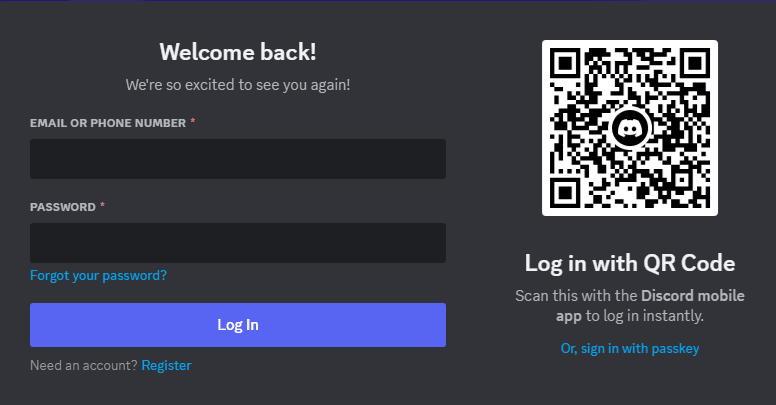
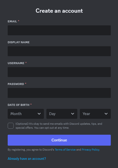
Discord
Redesigning the login and register form to increase and support accessibility.
The Redesign Process
Research
For the redesigning challenge, I chose Discord's signup and login form. Before this challenge, I had an idea of the WCAG and accessibility standards, so I thought it would be a good idea to choose a platform I'm familiar with. I asked the people around me about some complaints they may have with the signup/login form. This required them to go through the process of registering or logging in.
Problem
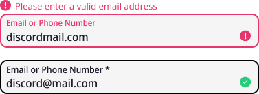
I began analyzing the signup form and identifying what needed improvement. Afterwards, I started going through the guidelines to determine areas of improvement, as well as the feedback I got from my peers. There were four prominent problems I noticed with the current version of the login and register form.
Based on the pain point identified by my peers and insights from my research, I brainstormed potential solutions.
Feedback
I presented my prototype to experienced designers in the field and obtained valuable feedback with the following takeaways:
Center feedback icons
Darken placeholder text
Review font sizes
Align feedback icons
Icons were initially center-aligned to the user input
Darken placeholder text
#B5BAC1 was used for placeholder text

Review font sizes
The minimum font size used was 14pt
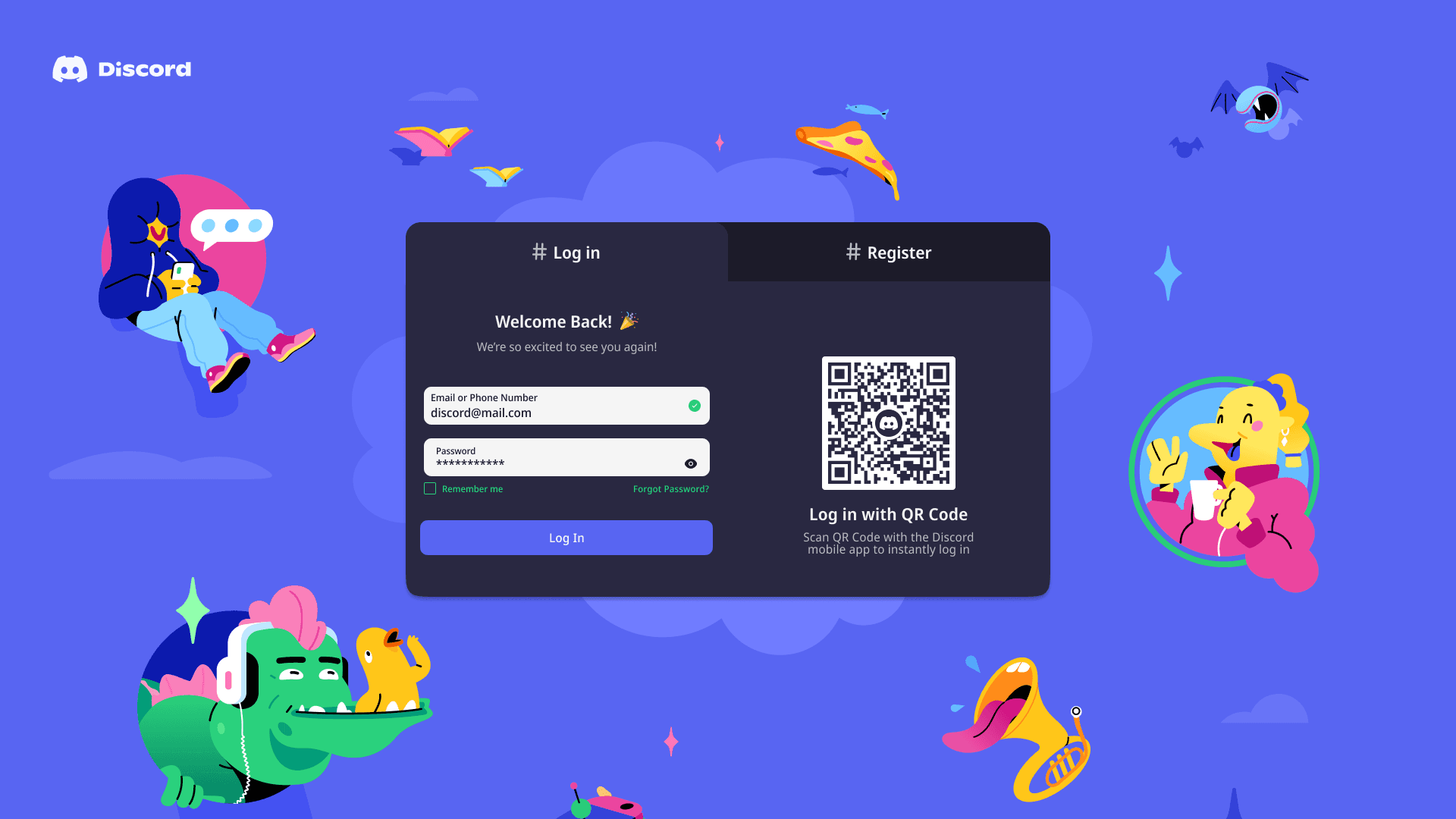
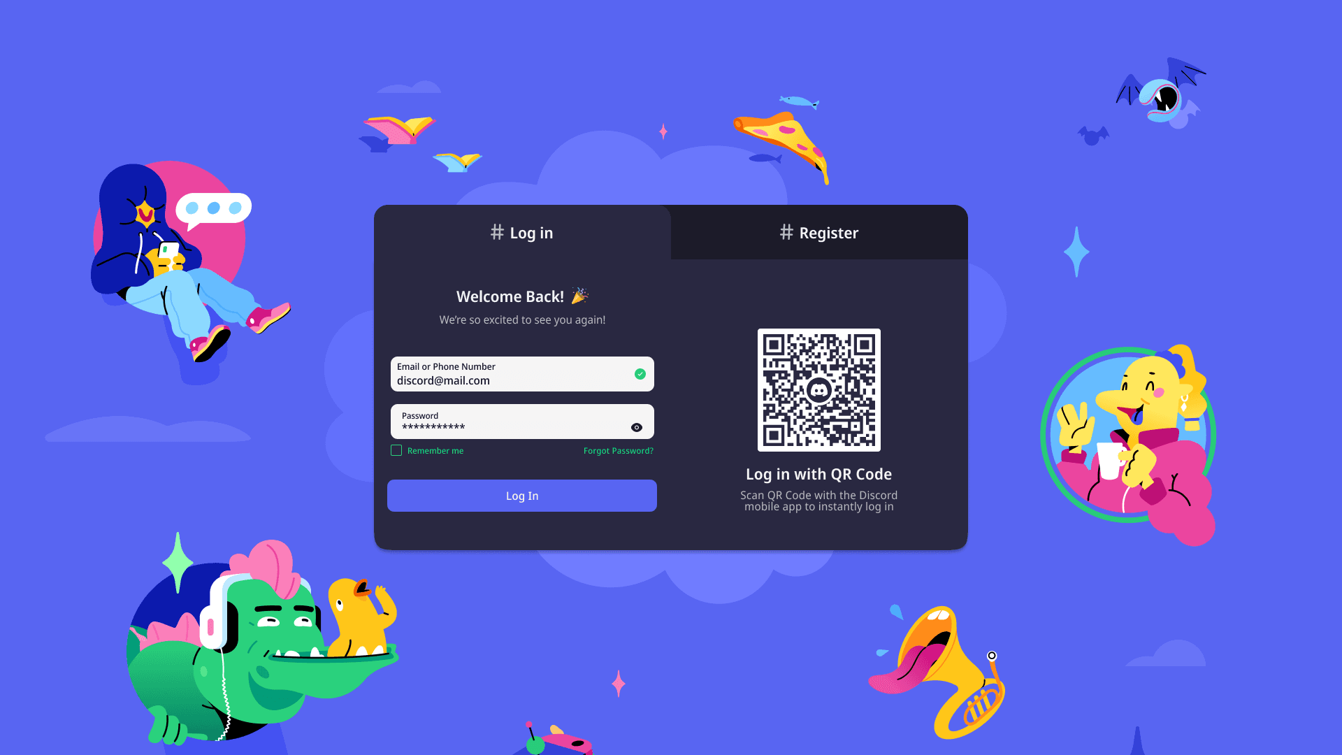
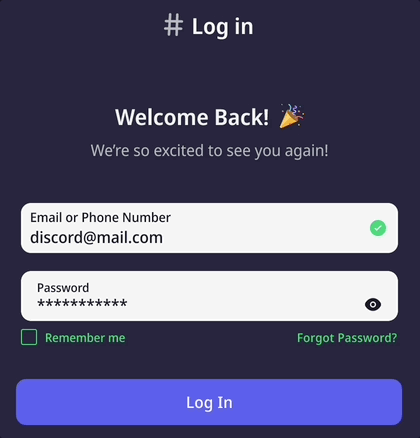
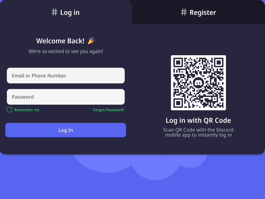
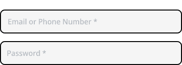
The final iteration
Login form
Register form
Conclusion
Some challenges I had with this redesign is, with the feedback I received and the knowledge I gained, I was able to update the form. Although I wasn't able to acquire metrics or feedback for the final product, I was able to further my understanding of accessibility and WCAG that I wouldn't otherwise gotten if I didn't get feedback with my first draft.